I grew up in Bangalore: a city in India with a population far higher than that of New York. In a “third world country” like India, I could see injustice everywhere, but I could also directly see how powerful communication and design could be.
A friend recently shared this observation: In India, you’ll still see a farmer who hauls around a beat up wooden cart full of coconuts. But the same farmer will exclusively accept Google or Apple Pay as payment for shucking one open for you. This juxtaposition of tradition and tech is apparent everywhere. But it is also clear that design interventions when well incorporated can vastly improve lives.
Tiny Cane Collective
Ritika Kedia
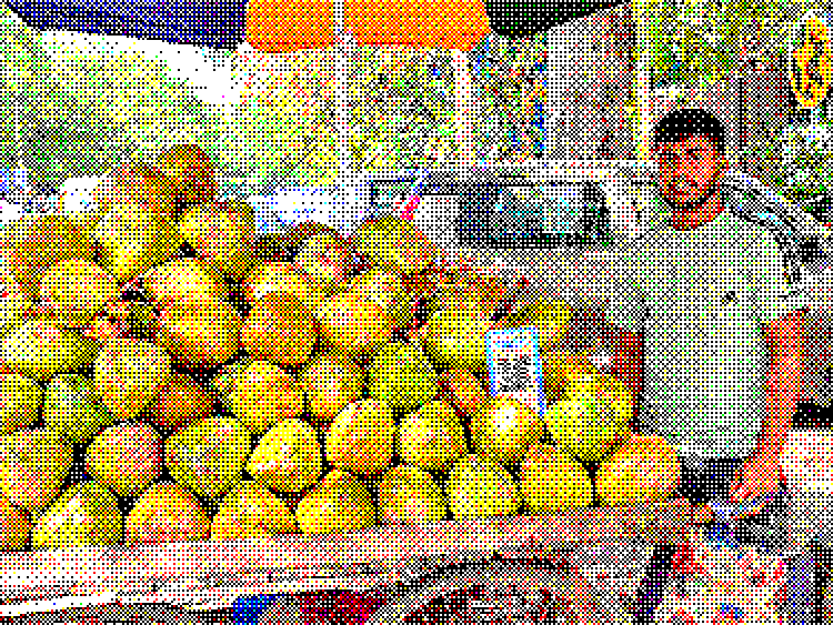
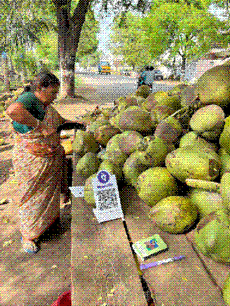
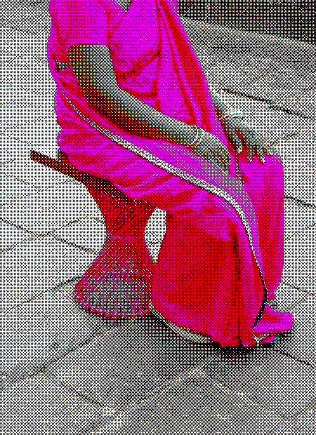
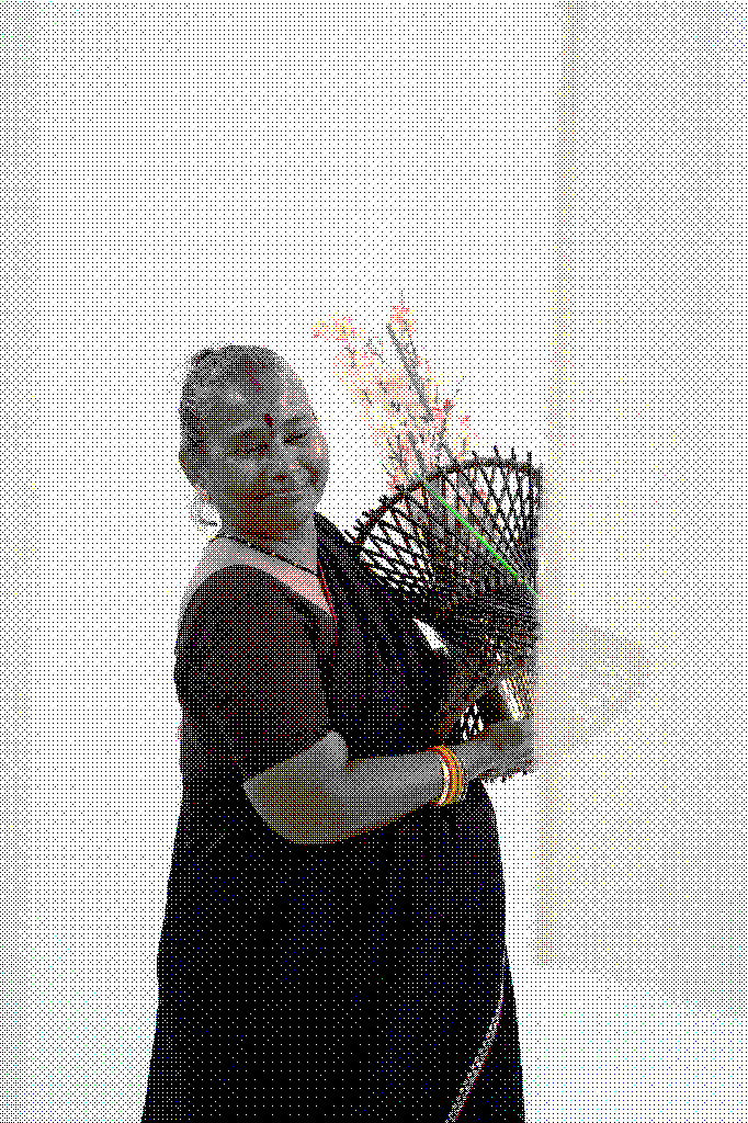
My friend Ritika at Tiny Cane Collective is improving the lives of local artisans in India every day.
↑ A chair made of tiny canes
By being transparent about the pricing and the structure of her organization, she’s proving that design can be an intervention to injustice. She’s making high end products where the money actually goes to the artisans involved.
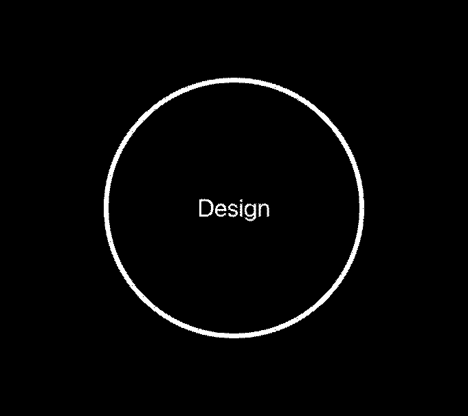
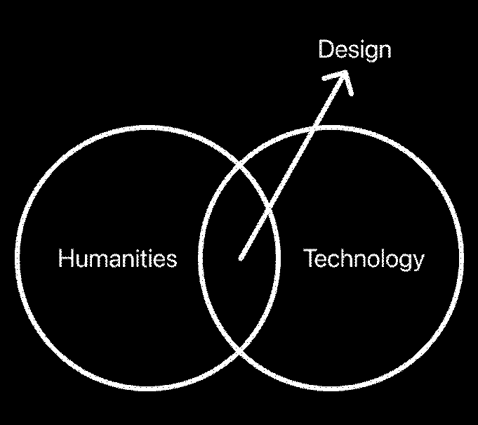
↑ Yet another venn diagram
As designers, we sit at the intersection of the humanities and technology. I think we are all stewards of some of the most powerful communication tools ever created. These tools have generated a lot of good in the world, as you can see. But their very power requires a deep sense of responsibility and a commitment to making the most ethically responsible decisions possible, every day.
↑ Understanding the time it took for 100 million people to adopt different “products” over the course of history.
It took print over a century to reach an audience of 100M. Radio did it in 45 years, Television in 20. Instagram & YouTube? Around 28 and 24 months, respectively. We’re in an era where it’s so easy to reach and influence one another. We have information and access at our fingertips. With AI? Who knows, maybe it’ll take a couple of hours to reach a 100M people.
By early November 2023 (~12 months after launch) ChatGPT reportedly had ~100 million weekly active users.
Generative AI reached a 39% adoption rate (101 million people) among U.S. adults ages 18–64 within two years of its introduction. This same level of adoption took the internet five years and the personal computer about 12 years to achieve.
But with great design power comes great design responsibility.
The scale and the speed with which these changes are happening is incredible. Taking into account the impact of new tech on people and society must become a more central part of how we as designers approach our work.
Let’s try an ethics puzzle.
(Don’t worry, it doesn’t involve a runaway trolley.)
A natural disaster happens. Could be a hurricane, an earthquake, or a landslide. Lives are at stake. An international disaster response organization asks Meta to provide information about people in the affected area: their location and their movements.
What does Meta do?
What does Meta do? If they share the data, they might be able to help save some lives. But, that’s a LOT of data to share about people. They might consider it close to surveillance or a breach of their privacy if they’re locations and movements are shared.
Peru, 2017
Believe it or not, this wasn’t a hypothetical – in March of 2017, Peru faced some terrible flooding. Humanitarian organizations engaged with Meta to see if they could help. They looked at usage trends on the platform and they reflected where people were located, where they were moving and whether they were checking in as “safe”.
But that’s Meta.
But that’s Meta – a global social media conglomerate with access to unfathomable amounts of data. Not designers like us sitting in this room today.
fireaid.info
Johan Michalove
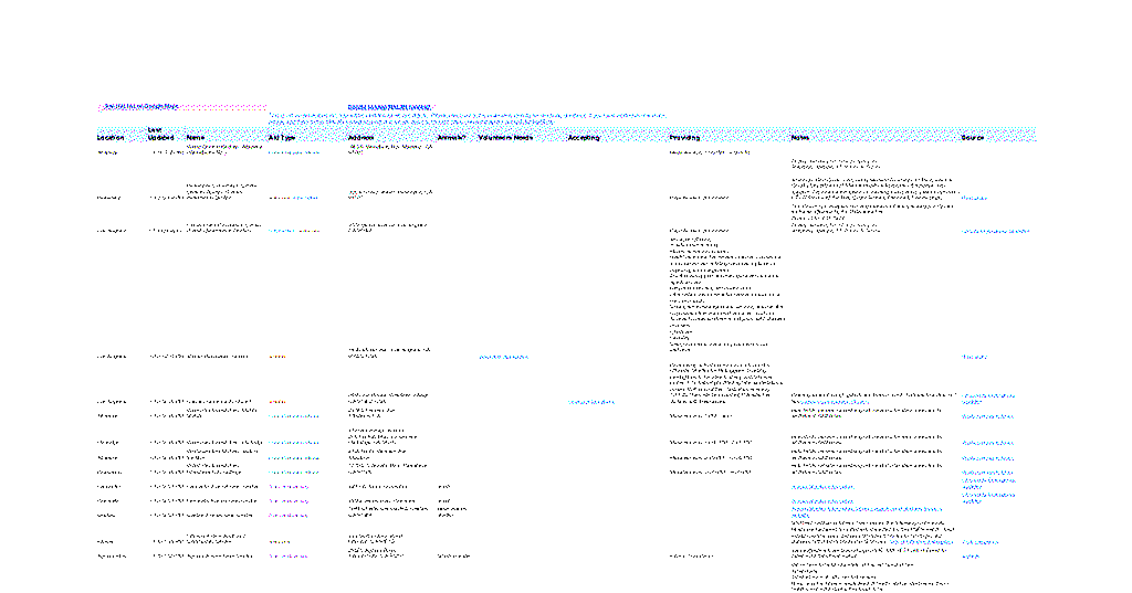
Early this year, LA faced horrifying news of wildfires. Spreadsheets from Mutual Aid Los Angeles were circulating but were incredibly hard to follow or keep track of.
↑ The spreadsheet
↑ Johan’s app
Johan Michalove responded by turning the spreadsheet into a live, mobile-friendly interactive map (and app). He started working on the tool the day after the fires broke out on January 8th, resulting in Fireaid.info. The app aggregated a large number of available resources and ways to volunteer, but made the information easy to filter and continuously update the status, availability and needs of each listing.
“The way that I see it is that we live in a world where we really have to be able to help each other”
~ Johan Michalove
Johan saw a clear design problem and was able to address it through a simple solution. But the most inspiring thing about this project is that he also realized the weight of responsibility of being a designer. This particular takeaway is one that I’ve had several times, too.
Good design isn’t always about making things look pretty.
In a time of crisis, being able to navigate through an app like this to give and receive information or aid is at the heart of what design is all about. As designers, we are responsible for making high impact ideas and tools easy, even when the stakes are this high.
Here’s a framework for how I approach this: the Four Quadrants of Design Responsibility. On the X-Axis, you have, from left to right, what we build at an increasing scale of things. From the pixel to the product to the whole ecosystem in which a product operates. An airline’s logo to it’s entire interconnected system of international flights. As you move from pixel to ecosystem, constraints, inter-dependencies and complexities grow.
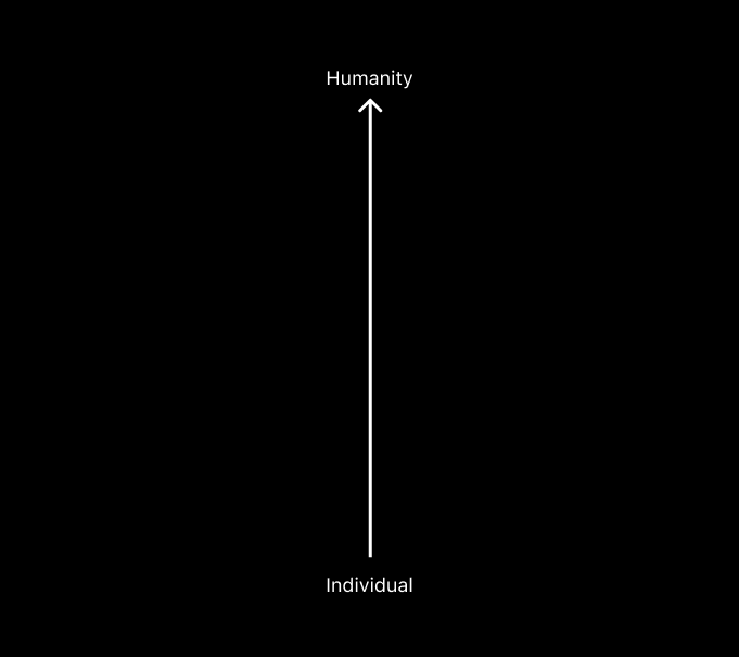
And on the Y-Axis, same idea, but the scale is the audience you’re designing for, starting with one individual human and working your way up to all of society. Like designing your Partiful invite for a small group of friends to a website viewed by millions of users. As the scale grows, the less we can assume about who we are designing for, their motivations, their culture, their needs and wants.
All four quadrants need design responsibility, but with varying sensitivities and sensibilities. Each quadrant requires a different calibration for complexity and abstraction but yet still a deep understanding of the audience.
The macro and the micro
At Tandem, I’ve learned to hold both these views in parallel. The macro and the micro. I try to bounce between the 10,000ft view – the conceptual, heady space that drives the purpose of the project, and the 1ft view – the actual execution, the pixel-pushing, and the attention to detail that makes all the difference.
Sunrise Movement
Tandem NYC
When we were working on Sunrise Movement’s rebrand, we ran into several complexities and had to make tons of compromises.
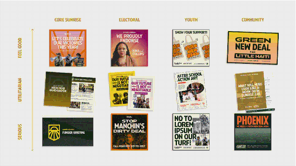
↑ Sunrise’s Brand Matrix
↑ A brand book that speaks to different audiences
We ended up coming up with a brand matrix that addressed a lot of different tones the organization would have to take with their communications. I realized there wasn’t a one-size-fits-all solution for organizations like this.
In the end, we weren’t designing for Sunrise’s 300K followers, we were designing for individuals spanning a range of identities – deeply attached or completely unaware of the organization.